A tornado diagram provides an easy way to keep your finger on the pulse of your project, whether you’re looking to launch a new product or service or simply want to achieve a particular project goal. In a nutshell, a simple tornado diagram presents the solution to how best to measure a risk’s sensitivity, but there’s more to tornado plots than this simple definition.
What is a Tornado Diagram?
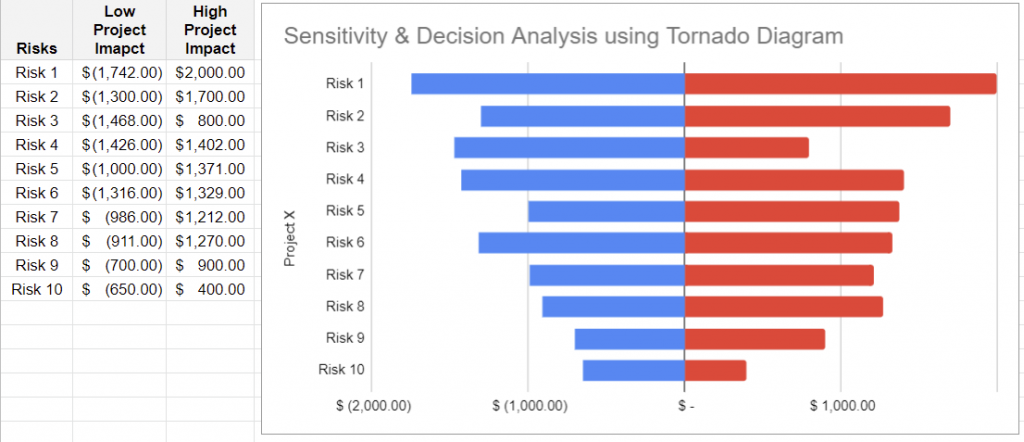
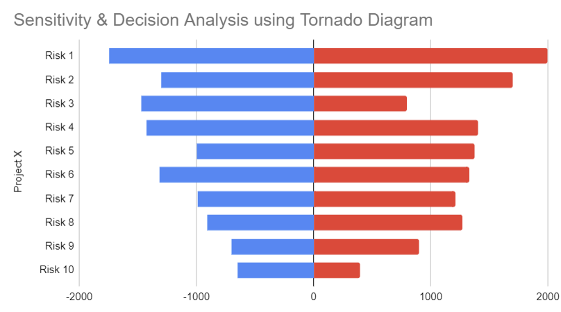
A tornado diagram is a display of sensitivity that presents the calculated correlation coefficient for each element of the quantitative risk analysis model that can influence the project outcome. This can include individual project risks project activities with high degrees of variability, or specific sources of ambiguity. Items are ordered by descending strength of correlation, giving the typical tornado appearance.
PMBOK®, 6th edition, ch. 11.4.2.5).
To add to the definition above let’s break down the two main features of a tornado plot:
- It’s a type of bar chart where the risk data categories are horizontal bars listed vertically, starting with the largest bar and ending with the smallest bar – hence the tornado shape.
- This special bar chart or funnel chart is used in sensitivity analysis to assess the potential effect of different variables and determine which variable has the most significant potential impact.

Why use Tornado Diagram Quantitative Risk Analysis?
There are several reasons why tornado plots are useful in risk analysis.
Helps you make a quality decision
Having a project risk register can have a lot of risks and then assessing each can be overwhelming. Using a tornado diagram for sensitivity analysis allows you to figure out what matters at a glance. This ultimately improves the quality of your decision and enables you to manage uncertainty while looking at the bigger picture.
That’s because you’re focusing on factors that not only have a greater impact but also have higher uncertainty.
Works for different stages of your project
Tornado diagrams have versatility because you can use them at any stage of your project, whether during product development or when developing your project budget.
Each time, you can rank the independent variables according to their sensitivity to keep an objective focus on things that matter.
Saves you time and energy
It can be confusing trying to figure out what’s important when there are so many variables involved. This can delay progress or have you focusing only on risks while failing to leverage crucial factors that drive the upside.
The good news is, tornado diagrams save time, energy, and a lot of headaches by showing you which areas to focus on.
Incorporates both objectivity and intuition
When coming up with input variables, you’re relying on available evidence, so you’re able to remain objective by incorporating mathematical sensitivity.
At the same time, if you intuitively feel that some input variables are a cause for concern, it’s possible to explain that intuition within the framework of the tornado so you don’t come off as biased.
Overall, tornado diagrams provide a more balanced approach to sensitivity analysis. This gives you a better idea of your high-risk priorities and helps you avoid a one-way sensitivity analysis.
Sensitivity Analysis using Tornado Diagram

- List all the independent variables that affect the Result/Project Objective.
- Determine a lower bound, central value, and upper bound for each independent variable. For instance, if you’re looking at independent variables that affect profitability, one of the variables is the estimated price per unit, with a lower bound of $0.50c, a central value of $1,00, and an upper bound of $1,50.
- Using the example above, calculate the profitability of your project using the lower bound, central value, and upper bound for price per unit while holding all other independent variables at their central value.
- Repeat step 3 for all other independent variables to get a range of profitability values.
- To construct the tornado chart using these results, first plot an X-axis and Y-axis. In this instance, the X-axis label represents profitability values for your project according to your calculations.
- The variable with the largest range produces the largest bar, so it’s grouped at the top on the Y-axis, followed by the second-largest bar until you have the smallest bar at the bottom. (remember it should look like a tornado). Each bar extends from the average base value.
Creating a Tornado Diagram Template Excel
What is an Excel tornado chart? This is an easy way to create a tornado chart in Excel via the following steps:
- Create your data table showing your uncertainties and input ranges from high to low as well as baseline values.
- Select the data table excluding the column for base values and choose the option for inserting a clustered bar chart.
- Right-click on the X-axis and select “Format Axis,” then input the required minimum and maximum values.
- While still on Format Axis options, go to vertical axis crosses and insert the average base value next to “Axis value.”
- Keeping the Format Axis window open, click on any of the bars to open the Series options pane, which allows you to adjust series overlap and gap width.
- At this stage, the process is complete, but you can also convert the diagram into a butterfly chart.
Free Tornado Diagram Template
Access our simple tornado diagram template here
How to read a Simple tornado diagram?
Now that you know how to create a Tornado Chart in Excel and the role of a tornado diagram in quantitative risk analysis, let’s look at how to conduct a tornado analysis.
So, let’s say you have a tornado diagram template. The rule of thumb here is that the largest bar represents the most sensitive variable.
This is where you focus most of your attention, while the smaller bars only need a bit of your attention. However, a tornado analysis is not always so cut and tried, but that’s the basic principle.
Tornado Diagram PMP Questions
So, what’s sensitivity analysis in PMP?
Simply put, it’s a quantitative risk assessment that allows you to determine which risks have a bigger impact on your project objective.
When carrying out such an assessment, you use a tornado diagram to quantify your project’s risk exposure.
You do this by looking at the probability of occurrence of each risk event (this is expressed as a range since you factor in high, low, and central values).
This gives you a better idea of the impact of each risk event on your project objective since the greater the range, the bigger the impact.
Tornado Diagram Alternatives
Decision tree Analysis
This is a tool that enables you to choose the best course of action given different alternative paths. Each course of action branches from the decision tree and points to the outcome of taking that path.
Our Google Decision Tree Templates free to use…
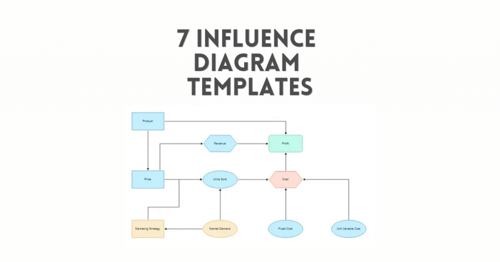
Influence Diagrams
An influence diagram uses ranges or probability distributions to represent sources of uncertainty in a project. Simulation techniques are then used to show elements with the greatest influence on project outcomes.

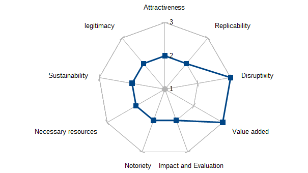
Spider charts
These are similar to tornado diagrams because they use a graphical technique for risk analysis. Spider charts also show the impact of each variable while holding other variables to the base value. However, the X and Y formats are different. Overall, spider charts allow you to see the impact of each variable in terms of whether it creates an increase or decrease in the result.

