Bar charts and histograms are both graphical representations of data. Bar charts are used to show comparisons between different groups or categories, while histograms are used to show the distribution of data.
It is crucial to show the data in a particular way after it has been gathered to highlight its features. The most effective technique to portray the data for this purpose is through diagramming. The data can be represented graphically in two different ways: a histogram and a bar graph. Data is displayed using bars in both of these terms. The way the data is shown in a bar graph and a histogram is the fundamental distinction between the two. In this article, we will cover Bar graph Vs Histogram examples and key differences
Understanding Histograms in Project Management
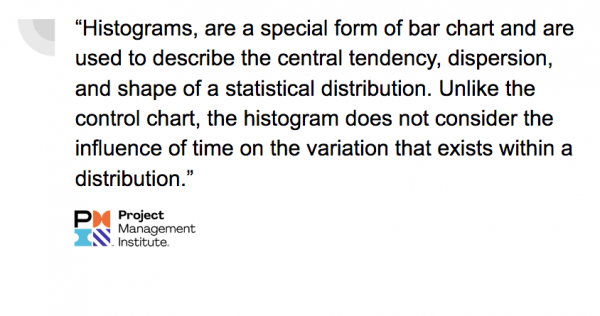
A histogram is a graphical way of displaying data. It is made up of bars, with each bar representing a different category. Histograms are a helpful way to visualize data and can be used to find patterns or trends.
The height of each bar corresponds to the frequency of that category.
Histograms are a good way to understand how often values occur in different categories.
Both bar charts and histograms can be used to show the same data, but they are typically used for different purposes. Bar charts are typically used to compare different groups, while histograms are used to show how data is distributed.
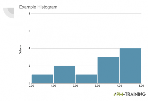
Components of a histogram
To create a histogram, you will need to first collect data from your project. This data can be collected from project documentation, project management software, or other sources.
Once you have collected the data, you will need to organize it into categories. Then, you will use a software program or online tool to create the histogram.
A histogram has a title, horizontals, verticals, and bars.
- The title tells us what the histogram is about.
- The plot is made up of bars that are placed alongside each other. Each bar represents a value in the data.
- The height of the bar represents the frequency of that value. Histograms are used to visualize the distribution of the data. The shape of the histogram can give us information about the distribution of the data.
- The horizontals are the axis that runs along the bottom and top of the histogram.
- The verticals are the axis that runs along the left and right side of the histogram. The bars are the parts of the histogram that represent the data.
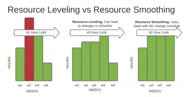
Resource Histogram
Resource histograms are graphical representations of the distribution of resources over time. They are used to illustrate the number of resources (usual people) required to complete a project.
By understanding the resource histogram, project managers can better plan and manage their projects.
The resource histogram can be used to track actual resources against planned resources.
This allows project managers to see where their project is under or overstaffed. It can also be used to predict future resource needs.
This is especially helpful when planning future projects.
Resource histograms can be created manually or with project management software. Once created, they can be used to help project managers make better decisions about their projects.
How do you interpret histogram results?
The histogram is used in project management to help visualize the distribution of data and to identify trends or patterns.
The histogram can be used to answer questions such as:
- What is the most common value?
- What is the range of values?
- Are there any outliers?
- What is the distribution of the data?
Even though histograms are a valuable tool for project managers, they should be used in conjunction with other data sources. Histograms should not be used to make decisions on their own, but they can be a helpful part of the decision-making process.
Examples of Histograms
They are often used in project management to visualize data such as project timeline, cost, or quality as Histograms can be very useful in identifying trends and patterns in data.
There are many different ways to create a histogram.
Below are three examples of histograms that can be used in project management:
1. Project Timeline Histogram
2. Project Cost Histogram
3. Project Quality Histogram
Each of these histograms can be used to help managers better understand their project data and make better decisions about their projects.
Examples of Resource Histograms
There are many different ways to create a resource histogram. Here are a few examples:
- Zoomable resource histogram: This type of histogram can be used to get a detailed view of how resources are being used over time.
- Treemap resource histogram: This type of histogram allows you to see how different types of resources are being used in relation to each other.
- Gantt chart resource histogram: This type of histogram is a popular choice for project managers, as it allows them to see how resources are being used in relation to the project timeline.
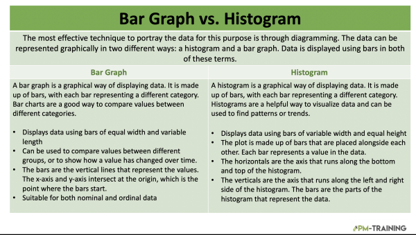
Bar Graphs in Project Management
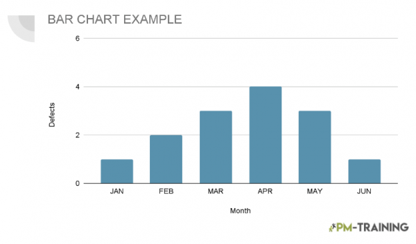
A bar graph is a graphical way of displaying data. It is made up of bars, with each bar representing a different category.
The height of each bar corresponds to the value of that category. Bar charts are a good way to compare values between different categories.
Components of Bar Graphs
When selecting a graph to use in project management, it is important to consider the data you are trying to communicate and the best way to visualize that data.
Bar graphs are a great option for data that can be broken down into discrete categories, such as budget items, task types, or project phases.
As a graphical way of displaying data. It is made up of bars, which are placed next to each other to show comparisons between values.
Each bar represents a value, and the width of the bar corresponds to the size of the value.
Bar graphs can be used to compare values between different groups, or to show how a value has changed over time.
There are three main components of a bar graph: the x-axis, the y-axis, and the bars.
The x-axis is the horizontal axis, and the y-axis is the vertical axis.
The bars are the vertical lines that represent the values. The x-axis and y-axis intersect at the origin, which is the point where the bars start.
Bar Graph Vs Histogram Key Differences
Both charts are useful for displaying data, but there are some key differences between them.
- Histograms are used to show the distribution of data, while bar graphs are used to compare data points.
- Histograms are best used when there is a large data set, while bar graphs are more suitable for smaller data sets.
- Histograms can show trends and patterns in the data, while bar graphs are best for comparing data points.
- histograms are better when you are dealing with large data sets that come from a continuous distribution. Bar graphs are better when you are comparing categorical data or data that has been bucketed into groups.
So, which chart should you use in your project? It depends on the data you have and what you want to show with it. If you need to compare data points, a bar graph may be the best choice. If you want to show the distribution of data, a histogram may be a better option.
Examples of Bar Graphs in Project Management:
There are a variety of ways to represent data in project management, but one of the most popular and commonly used methods is to represent data which can be used to track various project metrics over time.
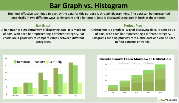
The first example is a basic bar graph that shows budget progress over time. This is a helpful way to track whether a project is on budget and identify any areas of concern.
Some other examples may include:
- Gantt charts
- Earned value charts
- Resource utilization charts
Bar graphs are a valuable tool for project managers and can be used to track progress, identify problems, and make decisions about the project.
What are histograms?
A histogram is a graphical representation of the distribution of data. It is often used in project management to visualize the distribution of tasks or resources. A histogram can help project managers identify patterns and trends in the data, which can be used to make decisions about the project.
What is a Bar Graph in Project Management?
A bar graph is a graphical representation of data that uses bars of different lengths to depict the relative magnitude of different values. They are often used in project management to visualize progress over time or compare different project elements. For example, a bar graph could be used to compare the progress of different teams on a project or to track the completion of project milestones.
What is a Resource Histogram?
Resource histograms can be created for any type of resource, including human resources, equipment, and materials. They can be used to track resource usage over the course of a project or to compare resource usage across different projects.
What are the main differences between Histograms and Bar Graphs in Project Management?
Simply put, Bar Charts are more about categorical data, while Histograms are about Quantitative data, Numbers, Plan, and Manage Quality
